When it comes to project and portfolio management analytic outputs, bubble charts are by far the most charming. Colorful and playful, they are reminiscent of a jar of gumballs. But they’re really more than just an pretty chart to throw in your PowerPoint or dashboard for a splash of color. When it’s critical to find the mix of projects that will add the most value to your R&D portfolio its imperative you have a strong grasp on the risk/reward balance – which is just what this chart type can provide.
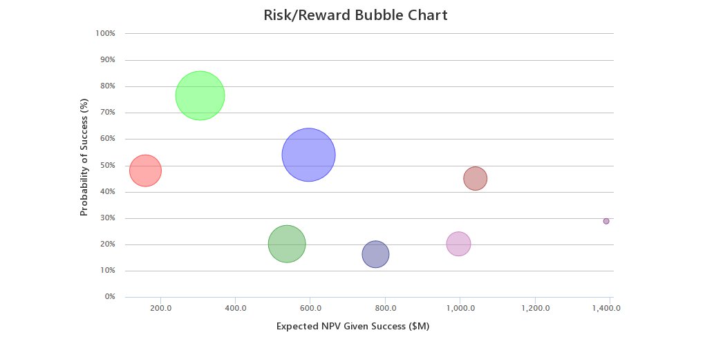
Bubble charts can take many forms depending on the industry and projects at hand. This post is geared specifically toward Risk/Reward Bubble charts as applied to R&D Portfolios. A Risk/Reward Bubble Chart is set up so that the vertical or y-axis is the Probability of Success (think of a drug that makes it through the regulatory and technical hurdles to market) and the horizontal, or x-axis, is the Expected NPV of the project given success. The size of the bubble serves as an indication of a third variable, usually development costs given success. That’s the standard set up for a Risk/Reward Bubble Chart – if your portfolio of projects requires a different set of metrics it’s a breeze to define your own axes to create a custom bubble chart.
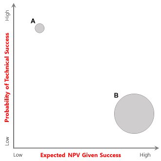
Within the figure shown Project A is characterized by low development costs, a high probability of technical success, but it’s expected NPV if successful is low. While Project B is expensive to develop, is unlikely to succeed technically, but has a very high expected NPV if successful.
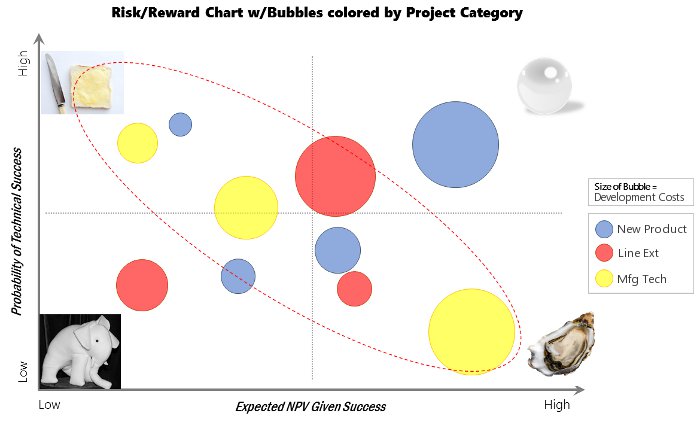
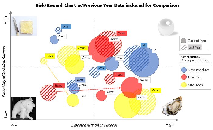
A common way to interpret a Risk/Reward Bubble chart is to split the chart into 4 quadrants, where projects falling within the the top left are considered an organization’s “Bread and Butter”, those in the top right “Pearls”, those in the bottom left “White Elephants” and those falling in the bottom right “Oysters”.
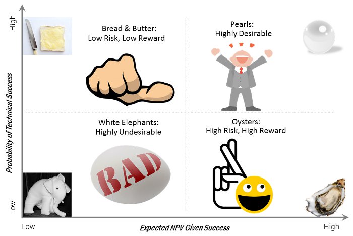
While you hope to have a portfolio chock full of pearls – that isn’t usually how things turn out. Typically, projects will fall in a line from the bread and butter quadrant down to the oysters as shown in the figure. If you desire more pearls, you’d better load up on oysters. There’s really no easier way. And if any white elephants are discovered they should be tamed and discarded immediately. It should be noted that the colors of bubble can take on meaning as well, many times they are colored according to a particular project category.
These project bubbles are not static. Uncertainty abounds within R&D portfolios and so these orbs will continually swell, rise, shrink and shift down as projects progress and more information leveraged. From one year to the next a bread and butter project may turn into a white elephant and one of your white elephants may turn into an oyster. It’s critical to have the ability to look back and compare the information contained within this chart from year to year or quarter to quarter as displayed in the image below which displays the set of projects last year as compared to this year. Notice the large shifts for Project Grind and Project Stomp.
Further to this, once a particular project has “made it out of the lab” as a success it can be useful to look back at how the project moved through the chart from inception to success. Or, think about where the project would be if you were doing all of this 10 years prior. Would it be in the same position? Most likely not. Why might that be the case? These types of thought experiments can be a useful exercise in helping to maintain a balanced R&D Portfolio.
Both DPL Portfolio, our tool for desktop portfolio analytics, and the DPMX System, a web-based portfolio prioritization system, can automatically generate a attractive Risk/Reward Bubble charts at the click of a button. If you’d like to take a look at a Risk/Reward Bubble chart or create a custom bubble chart of your own, I would encourage you to check out the DPMX System where this output and many other popular PPM analytics outputs can be generated on-demand for a simple example portfolio.