A customer once inquired about a new feature request for DPL 9. It went a little something like this:
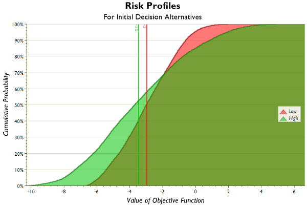
CUSTOMER: You know how DPL does that really cool Initial decision alternatives chart? The one where you can generate risk profiles – not just for the optimal decision alternative – but for all of the initial decision alternatives? And, they’re displayed conveniently in one chart for easy comparison? Like this:
US: Yes…
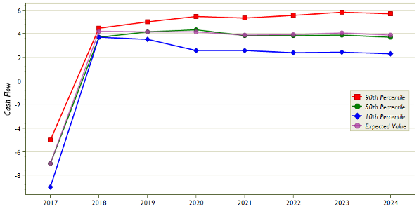
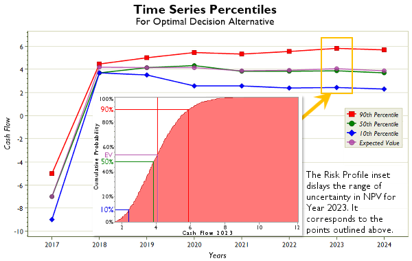
CUSTOMER: And you know how, if you set up a bunch of attributes in the model that track your cash flow over time, you can display the risk profiles for these attributes for multiple time periods within that awesome Times Series Percentiles Chart? It shows the 10th, 50th, and 90th percentiles and the expected value, but can also custom percentiles as well. It looks like this:
US: Yes, of course.
CUSTOMER: So why don’t you combine these two into a really great feature for DPL 9 that allows you to generate Time Series Percentiles for all of your Initial Decision Alternatives?
US: Done! It will be included in the next major upgrade, DPL 9, set to be released early next year. It will look something like this:
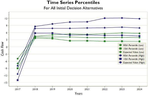
*CUSTOMER: Wow, you guys are the best! Oh, and sometimes I have a lot of decision alternatives so the chart might get a little busy. Could there be an option to display only the expected values on the chart?
US: Sure thing. Anything else?
Hmm… a 25% discount on a pre-release purchase of upgrades and new licenses of the DPL 9 Release?
Oh, why not! But only from now through December 31st! Here’s the coupon code and link
Coupon Code: DPL9PRERELEASE
Happy Holidays from Syncopation Software!